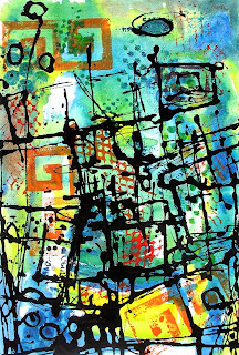
Taking the Prize
"Sinatra Bar"
Oil & Acrylic Painting
Quick Draw Grand Prize Winner
Recently, I won the Quick Draw Plein Air competition for the TBBCA Hyde Park Chalk Walk/Plein Air Festival. What is the Quick Draw all about? Basically, you have just two-three hours to capture the scene in plein air-live.
I had scoped out the location the day before and had pretty much everything compositionally mapped out in my head so I was pretty ready. I knew exactly what I wanted to capture in terms of design and energy.
In the photo is the scene that inspired me. Two friends had come to hang out with me for the day and they with over to the restaurant for lunch. I told them that they would be my models and they were great! The painting turned out well. It was really fun to paint and the crowd got a big kick out seeing it develop.
The only thing is that now after letting it be for a while I think I might change the added text. What do you think? Keeps the words or take them out? I played with cropping it just to see. If I decide to paint the words out , the painting would basically look like this...just a little taller.
Let me know your opinion. Seriously, I need your help. Thanx-Princess


Comments
I liked this piece just the way it was, but when I saw it without the words, I saw that it's very strong compositionally without the text and that if you remove the words, this piece could be more broadly interpreted. The text limits the perception of the piece because the viewer considers or even uses the words to describe the piece to himself. You're brave to consider altering a prize-winning piece, but I vote for doing just that. Hope my opinion helps! Jaime
JS
Thanks for the feedback. I am leaning close to taking out the text. Funny... FB comments like the text and they mostly were non artists. My blog and Twitter commenters are voting for no-Text and they are all artists. Funny.
One of Yvonne Lozanno's comments on Twitter is making me consider subduing the text in a way...Push it back as opposed to totally covering it up.
I will hang the painting during my Open Studio event this weekend in Ybor City-Tampa and poll my guests...get their feedback.
You all are making very good points. I will compile them all , process them and go BOLDLY Forward.
Thanks again for your input and collaboration on this painting!- Princess